IXD Navigation
date. 2021
client. McKinsey & Company
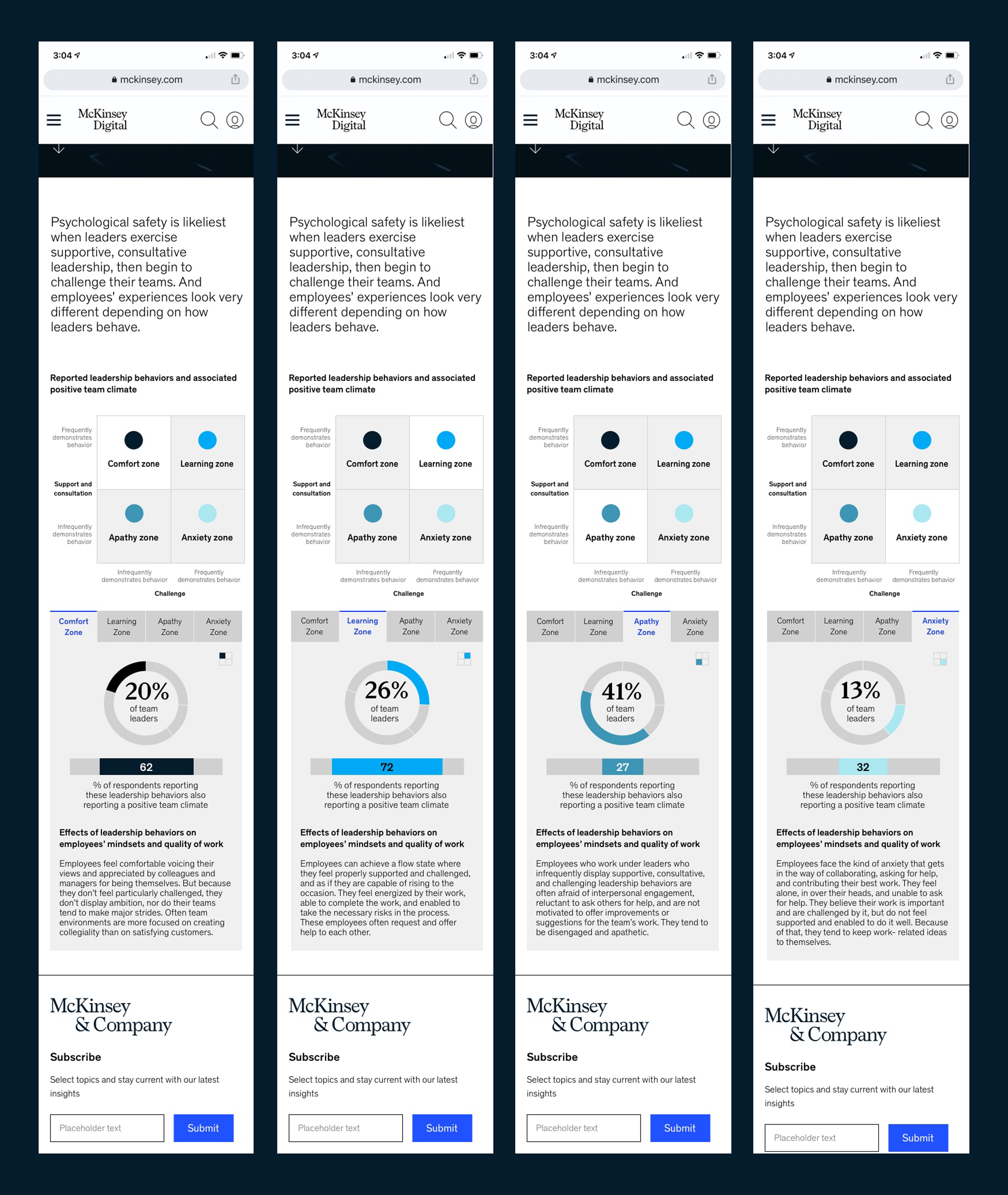
summary. Creating a mobile companion of this article, there were a TON of elements and information to work into a simple, clean, interactive design. I built the section below the title text "Reported leadership behaviors..." all in Ceros, which is an online UX/IX animation platform. Ceros renders a file/code snippet that can then be dropped into the existing another web page to create a fully interactive experience.
Here, I recreated the 4-up grid with the dots. A simple table chart, I designed this to map the explanatory information presented in the tabs below. In each tab, I combined the circle/pie chart with the percentage number it represents of leaders as they place within the table chart. For example, 20% of leaders fall into the "Comfort Zone." Below each pie chart, a subset of that percentage is shown by using the bar charts. The active area of each is centered in the full bar to visually reinforce the subset portion of its whole.
Using Gestalt design principles of placement and association, my design is intended to visually show that the reader is looking at percentages of percentages without being as confusing as possible. The interactive design of tabs here allows the viewer to see all this information without having to scroll forever. While the table chart is not clickable, the tabs are interactive and change the highlighted part of the table chart accordingly.
